
GCSE Biology (AQA)
331 videos | 14 hours
Please subscribe to watch this video.
This, and all other videos, are included in our premium subscriptions.
Premium accounts get access to all videos.
Enable autoplay to keep watching
Your browser is blocking videos from playing automatically. To turn it back on:
Safari (Mac): Click the Safari menu item in the top bar, then Settings → Websites → Auto-Play, then set Auto-Play to Allow All Auto-Play for the current website.
Safari (iPhone/iPad): open the Settings app, then Apps → Safari → Auto-Play, and select Allow All Auto-Play.
Interpreting Kidney Data
- Doctors and scientists use kidney data for healthcare and research decisions.
- Data includes measuring ion concentrations in different kidney parts.
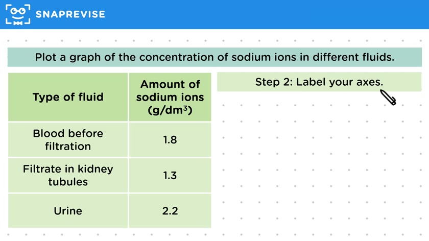
- Example provided: sodium ion concentrations in blood before and after kidney filtration.
- Concentration comparison involves simple subtraction (e.g., 1.8 grams per decimeter cubed in blood vs. 1.3 in kidney filtrate).
- Comparative statements are made based on data differences (e.g., 0.5 grams per decimeter cubed more sodium in blood than filtrate).
- Graph plotting involves choosing the right graph type (bar graph for discontinuous variables like fluid types).
- Labeling axes correctly on a graph is crucial (fluid types on x-axis, sodium ion concentration on y-axis).
- Bar labels and a key are necessary for clarity in graph representation.
- Scale setting on a graph requires identifying the highest data point and setting appropriate intervals.
- Consistency in bar width and spacing is important for a clear, readable bar chart.
- The process helps in visualizing and interpreting kidney data effectively in exams.
Please subscribe to access these revision notes.
This, and all other video notes, are included in our premium subscriptions.
Premium accounts get access to all videos and revision notes.
162
questions for Homeostasis and response
99
questions for Hormonal coordination in humans