
GCSE Combined Science (AQA)
622 videos | 38 hours
Please subscribe to watch this video.
This, and all other videos, are included in our premium subscriptions.
Premium accounts get access to all videos.
Enable autoplay to keep watching
Your browser is blocking videos from playing automatically. To turn it back on:
Safari (Mac): Click the Safari menu item in the top bar, then Settings → Websites → Auto-Play, then set Auto-Play to Allow All Auto-Play for the current website.
Safari (iPhone/iPad): open the Settings app, then Apps → Safari → Auto-Play, and select Allow All Auto-Play.
Graphs & Rates of Photosynthesis
- Photosynthesis rates can be limited by warmth, light, and carbon dioxide.
- Graphs can illustrate how these limiting factors affect the rate of photosynthesis.
- For exams, it's important to extract and interpret graphs showing the impact of limiting factors on photosynthesis rates.
- When plotting graphs, the limiting factor is placed on the x-axis and the rate of photosynthesis on the y-axis.
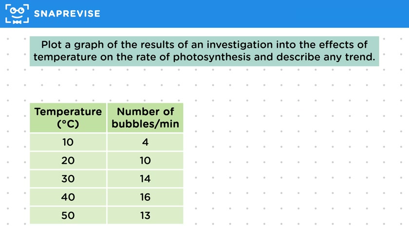
- If specific data on photosynthesis rates are unavailable, related aspects like oxygen bubbles produced by pondweed can be plotted.
- Proper graph plotting involves selecting appropriate scales for the axes and understanding the type of graph needed based on the data (discrete data uses bar charts, continuous data uses line graphs).
- Steps to plot a graph include identifying the type of graph, drawing axes, marking a linear scale, labeling axes with the independent variable (like temperature) and dependent variable (like number of bubbles per minute), and plotting values.
- A line or curve of best fit should be drawn, and the graph should be interpreted to describe trends, such as how changes in temperature affect the rate of photosynthesis.
Please subscribe to access these revision notes.
This, and all other video notes, are included in our premium subscriptions.
Premium accounts get access to all videos and revision notes.
50
questions for Bioenergetics
29
questions for Photosynthesis