
GCSE Combined Science (AQA)
622 videos | 38 hours
Please subscribe to watch this video.
This, and all other videos, are included in our premium subscriptions.
Premium accounts get access to all videos.
Enable autoplay to keep watching
Your browser is blocking videos from playing automatically. To turn it back on:
Safari (Mac): Click the Safari menu item in the top bar, then Settings → Websites → Auto-Play, then set Auto-Play to Allow All Auto-Play for the current website.
Safari (iPhone/iPad): open the Settings app, then Apps → Safari → Auto-Play, and select Allow All Auto-Play.
Menstrual Cycle Graphs
- Hormone levels in the menstrual cycle can be graphically represented.
- It's important to extract and interpret data from graphs of hormone levels for exams.
- Memorizing the exact shape of the graph is not necessary.
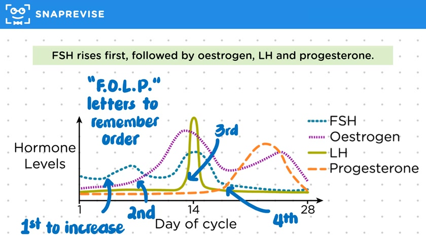
- The graph's X-axis represents days of the cycle (1 to 28), and the Y-axis shows hormone levels.
- Hormones represented include FSH (blue dash line), estrogen (purple dash line), LH (green solid line), and progesterone (orange dash line).
- Hormone levels increase in the order of FSH, estrogen, LH, and then progesterone.
- The acronym FOLP can help remember the order: FSH, estrogen, LH, progesterone.
- FSH increases first, causing a rise in estrogen levels.
- Increased estrogen subsequently inhibits FSH, leading to a decrease in FSH levels.
- Estrogen stimulates the release of LH, which peaks at day 14 to trigger ovulation.
- Post-ovulation, progesterone levels increase towards the end of the cycle.
Please subscribe to access these revision notes.
This, and all other video notes, are included in our premium subscriptions.
Premium accounts get access to all videos and revision notes.
95
questions for Homeostasis and Response
72
questions for Hormonal Coordination in Humans