
GCSE Maths (Edexcel)
435 videos | 33 hours
Please subscribe to watch this video.
This, and all other videos, are included in our premium subscriptions.
Premium accounts get access to all videos.
Enable autoplay to keep watching
Your browser is blocking videos from playing automatically. To turn it back on:
Safari (Mac): Click the Safari menu item in the top bar, then Settings → Websites → Auto-Play, then set Auto-Play to Allow All Auto-Play for the current website.
Safari (iPhone/iPad): open the Settings app, then Apps → Safari → Auto-Play, and select Allow All Auto-Play.
Pie Charts
- A pie chart shows the proportions of categories in a discrete data set as sectors that combine to make a circle
- The frequency of items inside each category is called the frequency
- Pie charts can be labelled or given a color key
- The frequency of a category can be found using the angle of its sector
- The formula to calculate the frequency is angle of sector over 360 degrees times total frequency
- Angles of 90 degrees or 180 degrees are important to recognize
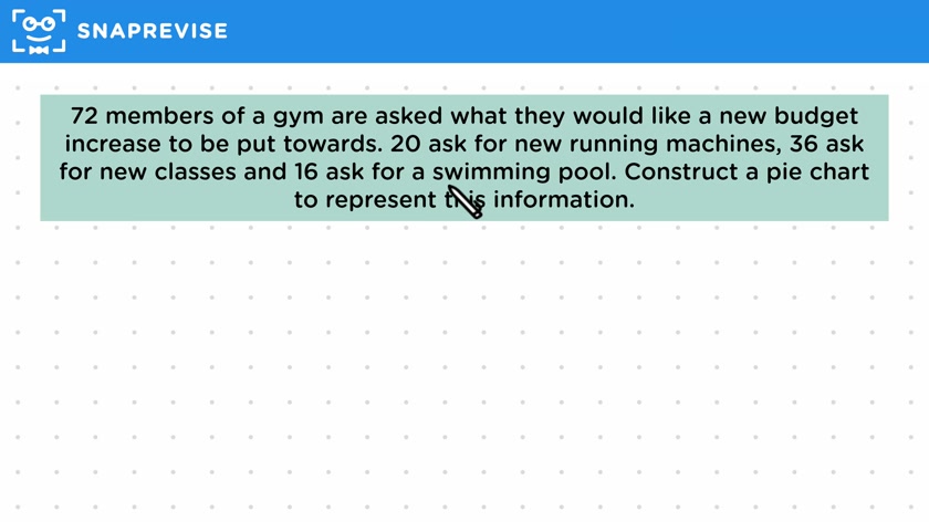
- To construct a pie chart, rearrange the formula to calculate the angles needed for the chart
- Use a protractor to draw the angles onto a circle
- In an exam, a circle will be provided for constructing the pie chart
Please subscribe to access these revision notes.
This, and all other video notes, are included in our premium subscriptions.
Premium accounts get access to all videos and revision notes.
116
questions for Statistics
116
questions for Statistics