
GCSE Maths (AQA)
435 videos | 33 hours
Please subscribe to watch this video.
This, and all other videos, are included in our premium subscriptions.
Premium accounts get access to all videos.
Enable autoplay to keep watching
Your browser is blocking videos from playing automatically. To turn it back on:
Safari (Mac): Click the Safari menu item in the top bar, then Settings → Websites → Auto-Play, then set Auto-Play to Allow All Auto-Play for the current website.
Safari (iPhone/iPad): open the Settings app, then Apps → Safari → Auto-Play, and select Allow All Auto-Play.
Statistics
Box Plots
4:40
Spec
3.6
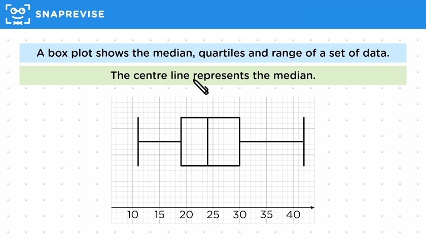
- A box plot shows the median, quartiles, and range of a set of data
- It is a quick and easy way to visualize the relation between these key values
- The ends of the plot represent the smallest and largest data values
- The box represents the quartiles, with the left side representing the lower quartile and the right side representing the upper quartile
- The range is the largest value minus the smallest value
- The interquartile range is the upper quartile minus the lower quartile
- The whiskers show how far the entire set of data is spread
- The center line represents the median, the middle value of the data set
- It is important to be able to read, draw, and analyze box plots to interpret data sets
Please subscribe to access these revision notes.
This, and all other video notes, are included in our premium subscriptions.
Premium accounts get access to all videos and revision notes.
Report an Issue
Spotted something wrong? Let us know and we'll take a look.