
GCSE Maths (AQA)
435 videos | 33 hours
Please subscribe to watch this video.
This, and all other videos, are included in our premium subscriptions.
Premium accounts get access to all videos.
Enable autoplay to keep watching
Your browser is blocking videos from playing automatically. To turn it back on:
Safari (Mac): Click the Safari menu item in the top bar, then Settings → Websites → Auto-Play, then set Auto-Play to Allow All Auto-Play for the current website.
Safari (iPhone/iPad): open the Settings app, then Apps → Safari → Auto-Play, and select Allow All Auto-Play.
Comparing Cumulative Frequency Graphs & Box Plots
- Cumulative frequency graphs can be used to compare datasets
- Plotting two graphs on the same axis allows for easy comparison of key features
- Gradients can be used to compare how quickly the cumulative frequency changes
- Positions of the median, lower quartile, and upper quartile can be compared
- Boxplots are a quick and easy way to show key values from a dataset
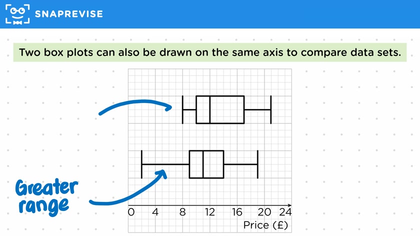
- Two boxplots can be drawn on the same axis to compare datasets
- Boxplots show the lowest value, lower quartile, median, upper quartile, and largest value
- Comparing boxplots can show differences in range, quartile positions, median, and interquartile range
- Boxplots can be drawn from a cumulative frequency graph using the same scale
- Drawing a boxplot from a cumulative frequency graph allows for easier comparison of key values
Please subscribe to access these revision notes.
This, and all other video notes, are included in our premium subscriptions.
Premium accounts get access to all videos and revision notes.
116
questions for Statistics
116
questions for Statistics