
GCSE Maths (AQA)
435 videos | 33 hours
Please subscribe to watch this video.
This, and all other videos, are included in our premium subscriptions.
Premium accounts get access to all videos.
Enable autoplay to keep watching
Your browser is blocking videos from playing automatically. To turn it back on:
Safari (Mac): Click the Safari menu item in the top bar, then Settings → Websites → Auto-Play, then set Auto-Play to Allow All Auto-Play for the current website.
Safari (iPhone/iPad): open the Settings app, then Apps → Safari → Auto-Play, and select Allow All Auto-Play.
Even Histograms
- A bar chart can be drawn for grouped discrete data by treating each group as a category
- Discrete data are values which can only take certain values
- Grouped frequency tables are used to sort data into ranges and determine the frequency of values within each range
- Bar charts can be used to represent grouped frequency data, with each range treated as a category and given its own bar
- The height of each bar represents the frequency found in each range
- Bar charts cannot be drawn for continuous data
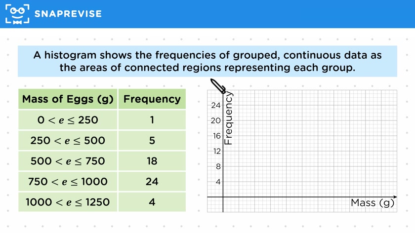
- Continuous data can be represented using a histogram, which shows the frequencies of grouped continuous data as connected regions
- Histograms use a continuous scale on the x-axis and do not have gaps between the bars
- Even histograms have groups of the same width, while uneven histograms have groups of different widths
- Even histograms can be plotted by representing the frequencies on the y-axis
- The process of drawing a histogram involves choosing a suitable scale for each axis and plotting the regions for each group using the given frequencies
Please subscribe to access these revision notes.
This, and all other video notes, are included in our premium subscriptions.
Premium accounts get access to all videos and revision notes.
116
questions for Statistics
116
questions for Statistics