
GCSE Maths (AQA)
435 videos | 33 hours
Please subscribe to watch this video.
This, and all other videos, are included in our premium subscriptions.
Premium accounts get access to all videos.
Enable autoplay to keep watching
Your browser is blocking videos from playing automatically. To turn it back on:
Safari (Mac): Click the Safari menu item in the top bar, then Settings → Websites → Auto-Play, then set Auto-Play to Allow All Auto-Play for the current website.
Safari (iPhone/iPad): open the Settings app, then Apps → Safari → Auto-Play, and select Allow All Auto-Play.
Frequency Polygon
- Frequency polygon is a graph showing group data by plotting midpoints against frequencies
- Frequency table shows how many data values fall in a particular range
- Data values go on the x-axis, frequency values go on the y-axis
- Points are plotted with x-coordinate as the midpoint of the range and y-coordinate as the frequency
- Points are joined with straight lines, except for the first and last points
- Frequency polygons are plotted for group data with equal ranges
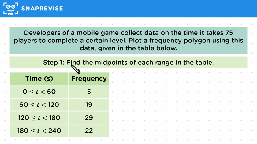
- Example given of plotting a frequency polygon for time taken to complete a level in a mobile game
- Steps given for plotting a frequency polygon: find midpoints, choose suitable scale, plot midpoints against frequencies, join points with straight lines
Please subscribe to access these revision notes.
This, and all other video notes, are included in our premium subscriptions.
Premium accounts get access to all videos and revision notes.
116
questions for Statistics
116
questions for Statistics