
GCSE Maths (AQA)
435 videos | 33 hours
Please subscribe to watch this video.
This, and all other videos, are included in our premium subscriptions.
Premium accounts get access to all videos.
Enable autoplay to keep watching
Your browser is blocking videos from playing automatically. To turn it back on:
Safari (Mac): Click the Safari menu item in the top bar, then Settings → Websites → Auto-Play, then set Auto-Play to Allow All Auto-Play for the current website.
Safari (iPhone/iPad): open the Settings app, then Apps → Safari → Auto-Play, and select Allow All Auto-Play.
Scatter Diagrams
- Scatter diagrams display bivariate data, which is data with two measurements taken for each item in the sample.
- Scatter graphs allow us to compare the relationship between the two measurements.
- Each axis on the scatter graph represents one type of data.
- The points on the scatter graph represent individual members of the sample or population.
- The x-coordinate of a point represents one measurement, and the y-coordinate represents the other measurement.
- Scatter graphs can show if there is a relationship between the two measurements.
- In the example given, as age increases, the test score generally increases.
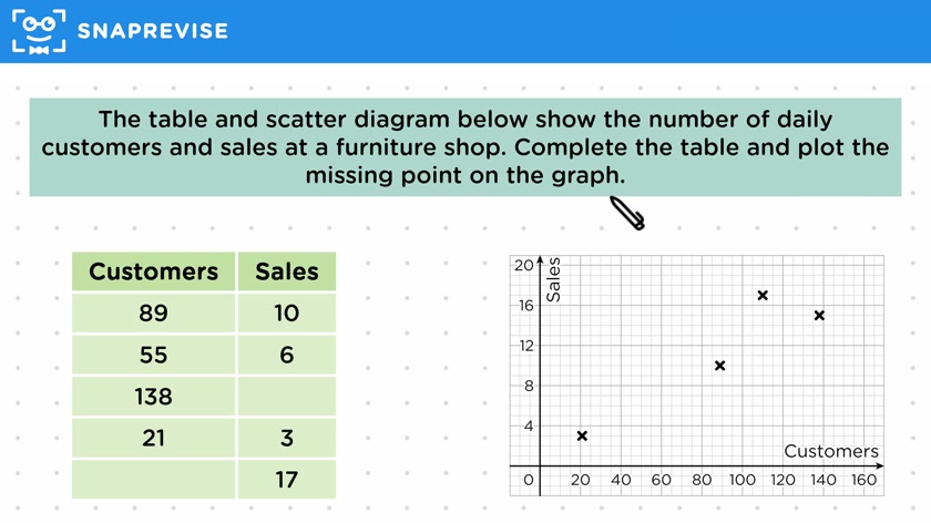
- To plot missing points on a scatter graph, we can use the x-axis and y-axis to find the corresponding values and draw lines to the correct data point.
- By comparing the table and graph, we can identify missing points and plot them using the given values.
Please subscribe to access these revision notes.
This, and all other video notes, are included in our premium subscriptions.
Premium accounts get access to all videos and revision notes.
116
questions for Statistics
116
questions for Statistics